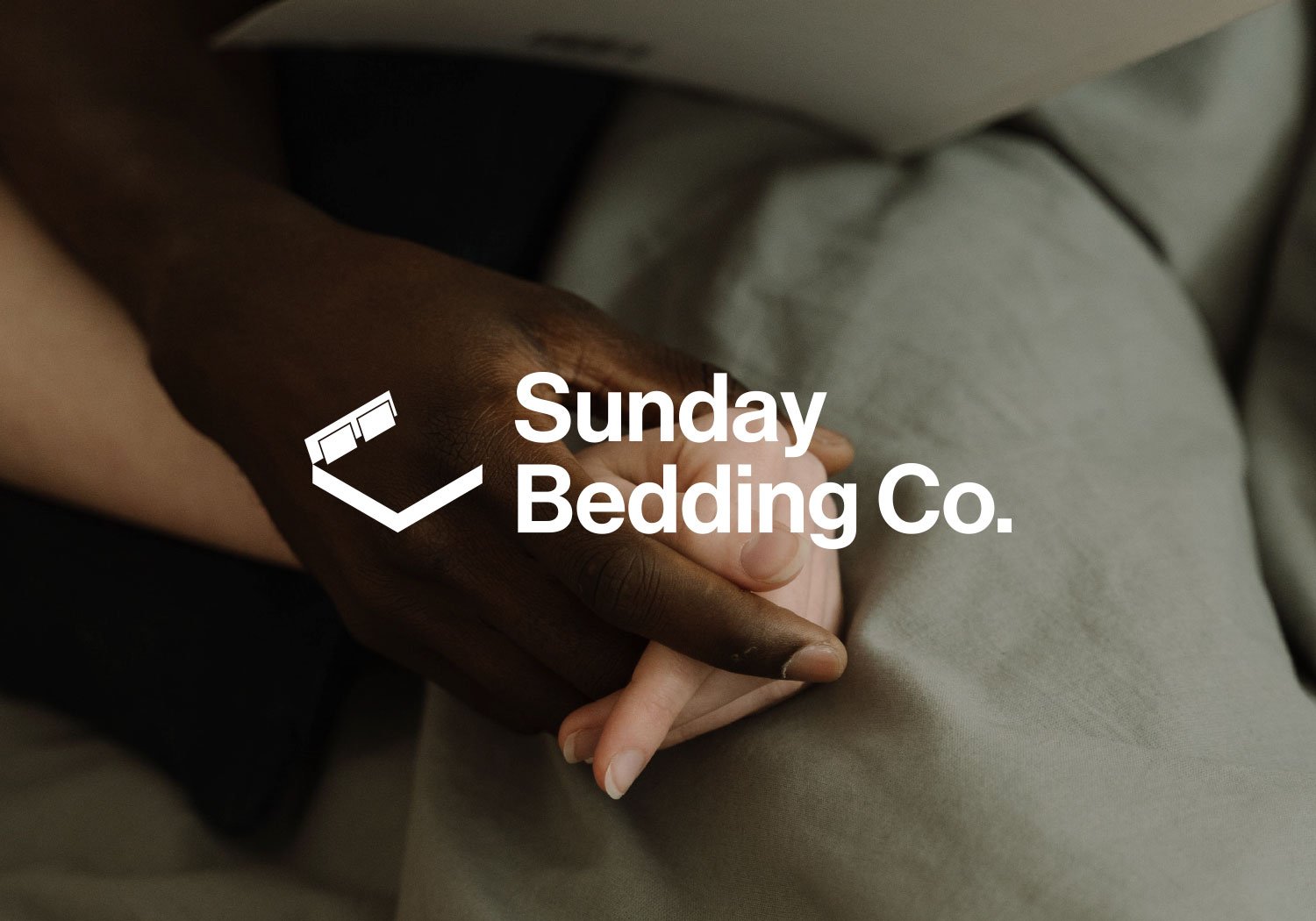
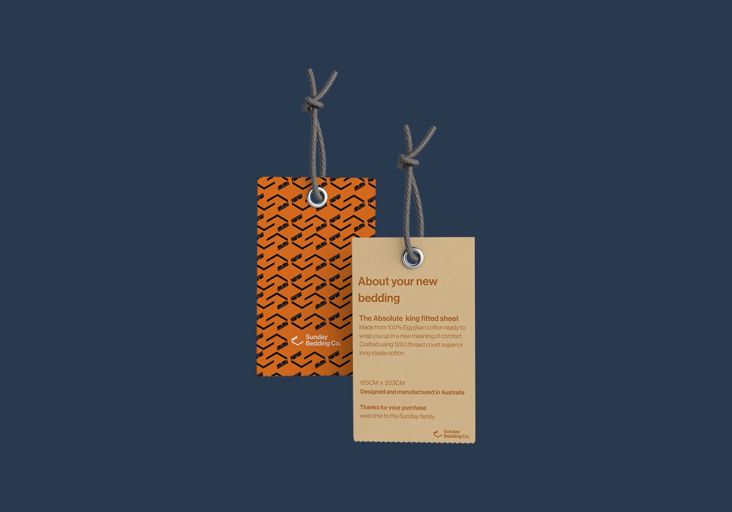
The mock brief was to create a modern bedding company that stood out in a highly competitive market. I determined that the branding for Sunday Bedding Co needed to be bold, modern, and refreshing. I decided to use a silhouette of a bed frame for the logo, as this would instantly convey the company's focus on bedding products. To keep the design modern, I used a clean and simple sans-serif font for the text.
When it came to the colour palette, I wanted to create a visual link between different bedding options for different seasons. So, I chose shades of orange and a lighter brown to represent the warm, comforting colours of bedding for summer months. For the colder months, I chose light and dark blue shades that would evoke feelings of calmness and relaxation.


